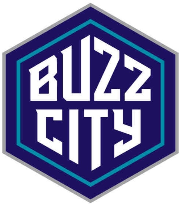
9 thoughts on “The Official New Charlotte Hornets Logos!”
Gutted..
“We wanted to recognize the heritage, but also include elements of an evolution that would take place with any brand over a 12-year period.”
???
With any brand?? An evolution that would take place over 12 years??? Ey.. What??
How many times have teams like the Bulls, Lakers, Red Sox, Yankees, Manchester Utd, (list is endless). How many times have they changed there logo?…
Or how many times have Nike and Adidas changed there logo?…
Answer: none. They have never changed there logos. Because big teams (or brands) with history dont! If its not broke, dont fix it!
Why couldnt the hornets keep the original logo??? I guess maybe, or i hope, its because of leagal reasons.
In my opinion this logos are terrible. I leave in Poland, in 90’s classic Hornets logo was the most popular! (lead with Bulls logo) I love Hornets and I’m happy to name back but why they replaced classic logo? Why?
Agree with Adam from Poland. In 90’s here in Latvia Hornets and Bulls were the most popular brands with their logos. For me new logos are not so bad. Hugo from the 90’s was not so aggressive 🙂 but 90’s are gone and it’s not a surprise that logos are different (also I were hoping that the new logos will be very similar to the old ones).


Gutted..
“We wanted to recognize the heritage, but also include elements of an evolution that would take place with any brand over a 12-year period.”
???
With any brand?? An evolution that would take place over 12 years??? Ey.. What??
How many times have teams like the Bulls, Lakers, Red Sox, Yankees, Manchester Utd, (list is endless). How many times have they changed there logo?…
Or how many times have Nike and Adidas changed there logo?…
Answer: none. They have never changed there logos. Because big teams (or brands) with history dont! If its not broke, dont fix it!
Why couldnt the hornets keep the original logo??? I guess maybe, or i hope, its because of leagal reasons.
In any case. Go Hornets
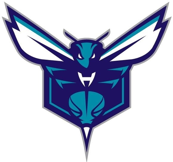
Horrible. Where’s the old school 90’s Hornets logo??? That’s one of the most popular in NBA history; I thought they were bringing that logo back!
the bobcats arent THAT BAD go KEMBA BIG AL AND ZELLER and BIZ will soon BUZZ on da court in second half of the year 2014!
awful logos 😦
bringbacktheORIGINALlogo!
Admin
Why did you remove my previous post?
In my opinion this logos are terrible. I leave in Poland, in 90’s classic Hornets logo was the most popular! (lead with Bulls logo) I love Hornets and I’m happy to name back but why they replaced classic logo? Why?
I didn’t delete it. I hadn’t approved it yet. Read the official release and it answers why. I like it
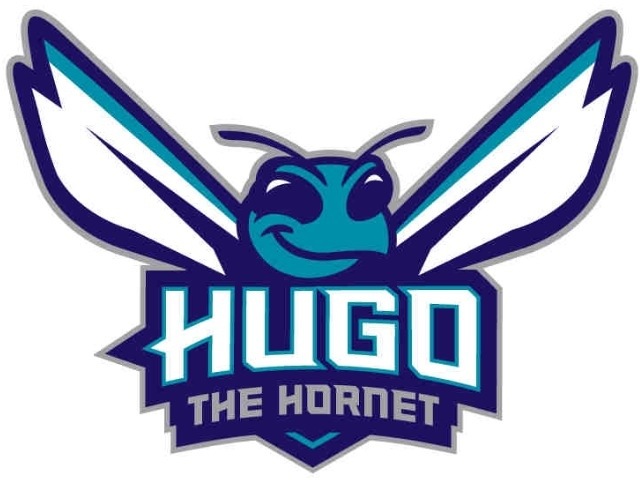
I like all of them except the smiling logo, looks like a silly Japanese knock off.
Agree with Adam from Poland. In 90’s here in Latvia Hornets and Bulls were the most popular brands with their logos. For me new logos are not so bad. Hugo from the 90’s was not so aggressive 🙂 but 90’s are gone and it’s not a surprise that logos are different (also I were hoping that the new logos will be very similar to the old ones).
Id like to hear what Bring back the Buzz (scotty & Evan) think of the new logo’s…???
Guys..???