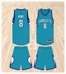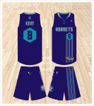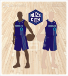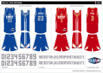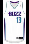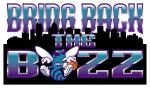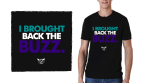
Big Dub strikes again and has created a concept portfolio for the return of the Seattle Supersonics below is the design with its notes explaining every little detail.
.

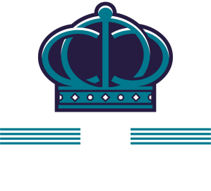
DESIGN NOTES
– Overall theme is from the 1985-1994 era which they borrowed from for their 2001 update.
– City Silhouette, solid color logo is a take on a similar version worn during the above period. It’s now a secondary placed at the ‘buckle’ of the short.
– Sonic Ball, logo is an updated version of the 1995-2000 logo.
– The tapered ends to the short stripe creates the Sonic Boom shape when paired with the jersey. The same shape that is featured in the Sonic Ball logo