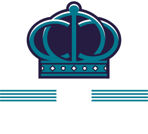
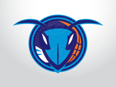
We have seen this first concept by Ian Bakar (A) floating around the internet for some time now and wanted the complete version up with all the logos and see how yall compare it to Big Dub’s (B) (The concept we have been using for a little over a year now) side by side. POLL AT THE BOTTOM!
A)
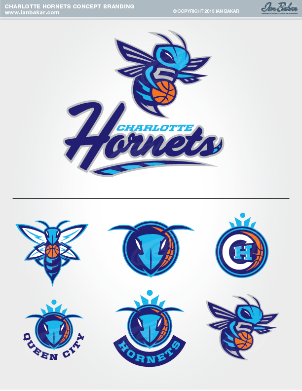

You can see the rest of Ian’s other concepts and art work here: http://ianbakar.com/
B)


B all day. The crown and basketball logo is awesome as well as the
as well as the purple jerseys*
Love and relate to B, but A keeps the buzz and will draw more excitement with it’s energy and edge.
I agree with Sherry, but that crown and basketball logo is so awesome!
I love the logo concepts in A, but hate the lettering and the uniforms. The logos are pretty awesome. The uniforms in B are what I’m expecting.