Well for the past few weeks we have been working with Rollin BigDub Garcia (the guy behind all the wonderful updated Charlotte Hornets Logos) trying to figure out a way to redesign our logo. When our first logo was created by me wife she did not have a great deal of time, the attention grew so fast and we wanted to have something out quickly people would identify with and recognize.The first one will always be special to us because it reminds us of when Charlotte first became excited about this idea, and my wife was able to add a personal Charlotte touch by making the big “B” shaped like the #13 for Bobby Phills. Now that we have kind of solidified ourselves as “Bring Back the Buzz” we wanted something that would capture the throwback 90s feel of our first logo but at the same time excite our followers with a bit more of a Charlotte feel. Thanks to Big Dub I feel like we have done that and I hope you love it!
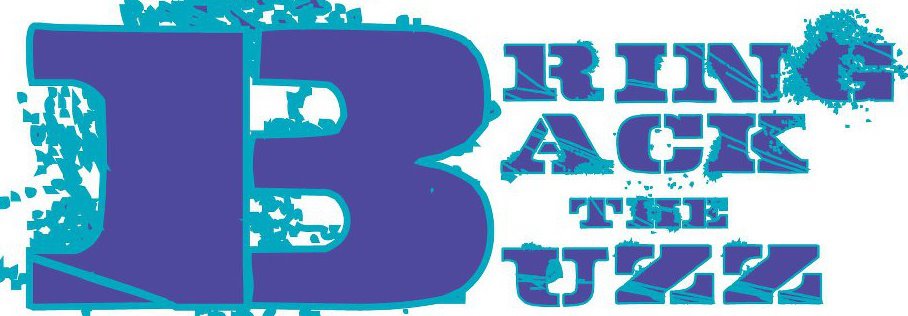
The old one

The New One

The old logos were so much better, please bring the old Buzz back
We plan on using both, but what is it that you like about the old one?